Text field
Campos de texto permitem que os usuários digitem e editem texto.
Campos de texto permitem que os usuários insiram texto em uma interface de usuário. Eles geralmente aparecem em formulários e diálogos.
Basic TextField
The TextField wrapper component is a complete form control including a label, input, and help text. It comes with three variants: outlined (default), filled, and standard.
Os atributos são suportados pelo TextField, como por exemplo required, disabled, type, etc. assim como o helperText que é utilizada para dar contexto sobre um campo de entrada, tais como, a entrada que será usada.
Propriedades de formulário
Standard form attributes are supported e.g. required, disabled, type, etc. as well as a helperText which is used to give context about a field's input, such as how the input will be used.
Validação
The error prop toggles the error state. The helperText prop can then be used to provide feedback to the user about the error.
Multilinha
The multiline prop transforms the text field into a TextareaAutosize element. Unless the rows prop is set, the height of the text field dynamically matches its content (using TextareaAutosize). You can use the <code>minRows and maxRows props to bound it.
Seleção
The select prop makes the text field use the Select component internally.
Adereços de campo
A forma principal é utilizando um componente InputAdornment. This can be used to add a prefix, a suffix, or an action to an input. Por exemplo, você pode usar um botão com ícone para ocultar ou revelar a senha.
kg
kg
Weight
$
kg
kg
Weight
$
kg
kg
Weight
$
A altura do campo na variante filled pode ser reduzida ainda mais ao renderizar o rótulo fora dele.
Margin
The margin prop can be used to alter the vertical spacing of the text field. Using none (default) doesn't apply margins to the FormControl whereas dense and normal do.
Largura total
A propriedade fullWidth pode ser usada para fazer com que o campo ocupe a largura total de seu contêiner.
Componentes
TextField is composed of smaller components ( FormControl, Input, FilledInput, InputLabel, OutlinedInput, and FormHelperText ) that you can leverage directly to significantly customize your form inputs.
Você também pode ter notado que algumas propriedades de campo nativas do HTML input estão faltando no componente TextField. Isto é intencional. The component takes care of the most used properties. Then, it's up to the user to use the underlying component shown in the following demo. Ainda, você pode usar inputProps (InputProps e InputLabelProps) se você quiser evitar algum boilerplate.
Campos customizados
Aqui estão alguns exemplos de customização do componente. You can learn more about this in the overrides documentation page.
Customization does not stop at CSS. You can use composition to build custom components and give your app a unique feel. Below is an example using the InputBase component, inspired by Google Maps.
🎨 If you are looking for inspiration, you can check MUI Treasury's customization examples.
useFormControl
For advanced customization use cases, a useFormControl() hook is exposed. This hook returns the context value of the parent FormControl component.
API
import { useFormControl } from '@material-ui/core/FormControl';
Retornos
value (object):
value.adornedStart(bool): Indicate whether the childInputorSelectcomponent has a start adornment.value.setAdornedStart(func): Setter function foradornedStartstate value.value.color(string): The theme color is being used, inherited fromFormControlcolorprop .value.disabled(bool): Indicate whether the component is being displayed in a disabled state, inherited fromFormControldisabledprop.value.error(bool): Indicate whether the component is being displayed in an error state, inherited fromFormControlerrorpropvalue.filled(bool): Indicate whether input is filledvalue.focused(bool): Indicate whether the component and its children are being displayed in a focused statevalue.fullWidth(bool): Indicate whether the component is taking up the full width of its container, inherited fromFormControlfullWidthpropvalue.hiddenLabel(bool): Indicate whether the label is being hidden, inherited fromFormControlhiddenLabelpropvalue.required(bool): Indicate whether the label is indicating that the input is required input, inherited from theFormControlrequiredpropvalue.size(string): The size of the component, inherited from theFormControlsizepropvalue.variant(string): The variant is being used by theFormControlcomponent and its children, inherited fromFormControlvariantpropvalue.onBlur(func): Should be called when the input is blurredvalue.onFocus(func): Should be called when the input is focusedvalue.onEmpty(func): Should be called when the input is emptiedvalue.onFilled(func): Should be called when the input is filled
Exemplo
Limitações
Shrink
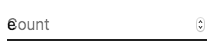
O rótulo do campo no estado de "shrink"(recuo) nem sempre está correto. O rótulo do campo deve recuar assim que o campo estiver exibindo algo. Em algumas circunstâncias, não podemos determinar o estado de "shrink" (input numérico, input datetime, input Stripe). Você pode notar uma sobreposição.
Para contornar o problema, você pode forçar o "shrink" do rótulo.
<TextField InputLabelProps={{ shrink: true }} />
ou
<InputLabel shrink>Contagem</InputLabel>
Rótulo flutuante
The floating label is absolutely positioned. It won't impact the layout of the page. Make sure that the input is larger than the label to display correctly.
type="number"
Campos com type="number" tem problemas potenciais de usabilidade:
- Allowing certain non-numeric characters ('e', '+', '-', '.') and silently discarding others
- A funcionalidade de rolagem para incrementar/decrementar o número, pode causar alterações acidentais difíceis de notar
e muito mais - consulte este artigo da equipe GOV.UK Design System para obter uma explicação mais detalhada.
Para validação de número, uma alternativa viável é usar o padão de campo, type="text", com o atributo pattern, por exemplo:
<TextField inputProps={{ inputMode: 'numeric', pattern: '[0-9]*' }} />
No futuro, pretendemos fornecer um componente de campo número.
Texto auxiliar
A propriedade de texto auxiliar afeta a altura do campo de texto. Se dois campos de texto forem colocados lado a lado, um com um texto auxiliar e outro sem ele, terão alturas diferentes. Por exemplo:
Please enter your name
Isso pode ser corrigido passando um caractere de espaço para a propriedade helperText:
Please enter your name
Integração com bibliotecas de campo de terceiros
Você pode usar bibliotecas de terceiros para formatar um campo. Você precisa fornecer uma implementação personalizada do elemento <input> com a propriedade inputComponent.
A seguinte demonstração usa as bibliotecas react-text-mask e react-number-format. O mesmo conceito pode ser aplicado para, p. ex. react-stripe-element.
O componente de entrada fornecido deve expor um ref com um valor que implemente a seguinte interface:
interface InputElement {
  focus(): void;
  value?: string;
}
const MyInputComponent = React.forwardRef((props, ref) => {
  const { component: Component, ...other } = props;

  // implemente a interface`InputElement`
  React.useImperativeHandle(ref, () => ({
    focus: () => {
      // lógica para focar o componente de terceiro renderizado deve ser feita aqui
    },
    // ocultando o valor, por exemplo, react-stripe-elements
  }));

  // O `Component` abaixo será seu `AlgumComponenteDeTerceiro`
  return <Component {...other} />;
});

// uso
<TextField
  InputProps={{
    inputComponent: MyInputComponent,
    inputProps: {
      component: SomeThirdPartyComponent,
    },
  }}
/>;
Acessibilidade
Para que o campo de texto seja acessível, o campo deve estar vinculado ao rótulo e ao texto auxiliar. Os nós DOM subjacentes devem ter essa estrutura:
<div class="form-control">
  <label for="my-input">Endereço de e-mail</label>
  <input id="my-input" aria-describedby="my-helper-text" />
  <span id="my-helper-text">Nós nunca compartilharemos seu e-mail.</span>
</div>
- If you are using the
TextFieldcomponent, you just have to provide a uniqueidunless you're using theTextFieldonly client side. Until the UI is hydratedTextFieldwithout an explicitidwill not have associated labels. - If you are composing the component:
<div class="form-control">
  <label for="my-input">Endereço de e-mail</label>
  <input id="my-input" aria-describedby="my-helper-text" />
  <span id="my-helper-text">Nós nunca compartilharemos seu e-mail.</span>
</div>
Projetos Complementares
For more advanced use cases, you might be able to take advantage of:
- react-hook-form: React hook para validação de formulários.
- react-hook-form-mui: MUI and react-hook-form combined.
- formik-material-ui: Bindings for using MUI with formik.
- redux-form-material-ui: Bindings for using MUI with Redux Form.
- mui-rff: Bindings for using MUI with React Final Form.
- @ui-schema/ds-material Bindings for using Material UI with UI Schema. JSON Schema compatible.
- @data-driven-forms/mui-component-mapper: Bindings for using Material UI with Data Driven Forms.